 uh oh
uh oh
Font Squirrel Ruined Lato Light Font
Posted on: 02.12.2014
I recently came across an interesting problem with one of our sites concerning the look of a font. The font was Lato Light and the browser was Chrome on Windows 7.
Here’s a shot of the problem.

As you can see the ‘g’ is doing something very strange when the font is small. It’s getting weird artifacts on either side that looks horrible.
Was it Chrome?
I develop on a Mac but used to use a Windows machine. I’ve come to learn that Windows hasn’t really done the best jobs with fonts (it is getting better) when compared to a Mac. As I went down the rabbit hole with this problem I dug up a lot of dirt on Chrome on Windows and it’s font rendering engine and how horrible it is. So this is where I spent most of my time. I did search after search trying to find the issue. I found fixes such as using the SVG file over the WOFF file in the font stack. I played around with it but it never really seemed to fix the issue.
The weird issue is that I could replicate this issue on every one of our sites that used the Lato Light font. But I also opened the Lato Light font on Google Fonts and could NOT replicate it in the preview page. This was the biggest hint to what was wrong.
Was it Google Fonts?
So something was different between Google Fonts and my pages. I looked through the CSS stack and couldn’t find anything that was different (since there wasn’t). I then re-downloaded the fonts from Google Fonts to try them. I only received the .ttf files which reminded me that I must have used Font Squirrel’s Webfont Generator to generate the other necessary files. With the Google Font .ttf files I added in a new font-family and made the current one only load the current .tff version. This enabled me to toggle between the two. Here’s what happened when I toggled between the two.

- Lato 1: Original Font
- Lato 2: Google Font .ttf
The funky font issue was gone! But why had this fixed it?
Was it Font Squirrel?
I then started poking around at Font Squirrel. They have the Lato font available there but only as .ttf I would still need to use the generator. Over the past few years I’ve used the font generator without any issue but didn’t know much about it. I started playing around with the 3 main options: basic, optimal, and expert. The default setting is optimal and this is how the original webfonts would have been created. I poked around in expert, there were a lot of options and I wasn’t about to begin to pretend to understand most of them. But there was another option, basic. The label for this option is, “straight conversion with minimal processing.” This seemed to be exactly what I needed. So I uploaded a fresh Lato Light .tff and selected the basic setting. I created a third Lato font-family in the CSS so that I could toggle between the three. Below is the result.

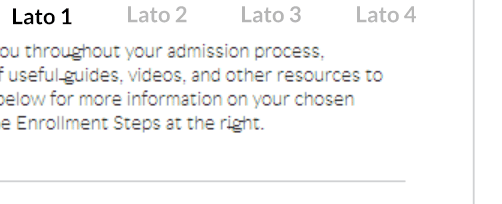
- Lato 1: Original Font
- Lato 2: Google Font .ttf
- Lato 3: Google Font .ttf Font Squirrel Basic
As you can see there is no difference between versions 2 and 3, but a huge difference between version 1 (the original). I still needed to do one more test to check my sanity to see if it was Font Squirrel. So I uploaded the same .ttf file and set the output to ‘optimal’ and created a fourth font-family in my CSS. Below are the results:
- Lato 1: Original Font
- Lato 2: Google Font .ttf
- Lato 3: Google Font .ttf Font Squirrel Basic
- Lato 4: Google Font .ttf Font Squirrel Optimal
You can see that versions 1 and 4 both look the same and horrible. Versions 2 and 3 look better and aren’t having the issue. It would appear that the Font Squirrel ‘optimal’ setting was the culprit. From now on I will only use the ‘basic’ setting and hope others will as well.